
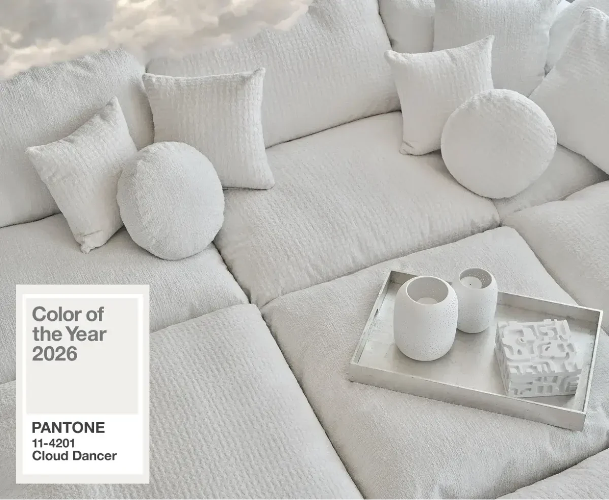

When Pantone announced Cloud Dancer (PANTONE 11-4201) as its 2026 Colour of the Year, it described the hue as “a billowy, balanced white” meant to serve as “a whisper of calm and peace in a noisy world.” (Creative Review)
At face value: a soft, serene neutral — a foundation on which fashion, interiors and creativity could start fresh. But within hours the white-on-white monotone had already split opinion.
Why Some Are Welcoming Cloud Dancer
- A fresh start and calm reset. Pantone’s team say the selection reflects a cultural moment: “a world ready to pause, reflect, and reset.” (Creative Boom) In a media-saturated, hectic time, Cloud Dancer offers “quiet reflection” — a blank canvas for thoughts, creativity, or simple living. (Creative Review)
- Versatility and understated elegance. As a neutral, Cloud Dancer can easily accompany bold or muted tones alike; in design and fashion, it promises airy minimalism, light-filled spaces, and soft silhouettes especially when paired with natural materials or gentle shapes. (Homes and Gardens)
- Sustainability and timelessness over “fast trends.” In a world where trends come and go, a neutral like Cloud Dancer can outlast fads — giving individuals a chance to define style on their own terms rather than chase fleeting colour cycles.
In that sense, the choice does not scream “look at me” — but rather whispers, “Calm down. Start again.”
Why Many Are Unimpressed — Or Outraged
Still, the reactions have ranged from lukewarm disappointment to outright criticism.
- Some call it “boring” or “uninspired.” Numerous commentators slammed the pick as a “colourless colour” — a let-down after years of bold, expressive hues. One online commenter reportedly asked: “Is the color in the room with us?” (The Independent)
- More seriously: white-washing and political resonance. For some, the choice of a white shade at a time of heightened awareness around race and representation doesn’t feel neutral at all. Critics have called the move “tone-deaf” or even accused it of evoking, intentionally or not, associations with whiteness and cultural erasure. (artnews.com)
- A sign of retreat, not progress. Rather than reflecting bold change or optimism, Cloud Dancer is being interpreted by some as symbolic of retreat — a “reset” that erases nuance, personality, or daring, in favour of bland neutrality. (Forbes)
In other words: what was likely meant as a gentle embrace of calm and clarity is being read by many as a bland statement — or worse, a political one.

Colour-of-the-Year ≠ Universal Approval
This schism in public reaction underscores a broader truth: just because a colour is chosen as “the colour of the year” doesn’t guarantee universal love.
- The selection process is shaped by cultural trends, industry forecasts, and design sensibilities — not by consensus or popularity. (ABC)
- A colour might appeal deeply to some — who see it as peaceful, timeless, versatile — while simultaneously feeling predictable, dull, or even problematic to others.
- The meaning of colour is often deeply personal (or political). What Pantone might view as serene neutrality can in another context be interpreted as erasure, blandness, or even symbolism linked to identity politics.
In short: a Pantone Colour of the Year is more a conversation starter, not a decree.
Why That’s Actually the Point
Maybe Cloud Dancer — and reactions to it — are exactly what the exercise was meant to provoke. A conversation about:
- what we crave (calm? simplicity? reset?)
- what we reject (noise? overstimulation? change?)
- what we bring into our homes, wardrobes and lives: do we want bold, expressive statements — or subtle, serene backdrops?
- how context and identity shape even something as seemingly innocent as a shade of white
By picking Cloud Dancer, Pantone hasn’t given us a trend so much as a mirror. A mirror reflecting our anxieties, hopes — and disagreements.
So … Is Cloud Dancer Worth Embracing?
I think it depends. For anyone longing for minimalism, calm, or a “blank slate” — whether in design, fashion, or life — Cloud Dancer can be quietly beautiful, grounding and versatile.
For those who see boldness, contrast, and colour as central to self-expression, it may feel limiting, overly safe, or even charged with unintended meaning.
But the beauty of colour — and culture — is in the plurality of interpretation.
And perhaps that is exactly why “Colour of the Year” should feel provocative sometimes: to make us stop, question, and reflect.
